Lesson 8: Color Psychology in Interiors
Discover how color affects your mood and behavior at home. Learn how to use color psychology in interior design to calm, energy, or balance in every room.

How Colors Influence Mood, Behavior, and Atmosphere in Your Home
Have you ever walked into a room and instantly felt calm, or suddenly anxious? That reaction isnt random. Ist color psychology at work.
Color is one of the most powerful tools in interior design. It shapes how we feel, think, and even act within a space. When used intentionally, color can make a room feel energizing or serene, cozy or open, inspiring or restful.
Let's break it all down simply, so you can use color with purpose and confidence.
What is Color Psychology?
Color psychology is the study of how colors affect our emotions and behavior. It explores how different hues, tones, and combinations influence the way we feel in a space.
In interior design, it's about using color not just for beauty, but for function. Do you want your bedroom to soothe you? Your kitchen to energize you? Your office to focus you? Color helps make that happen.
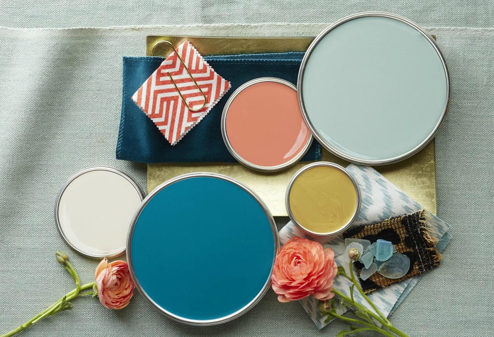
Warm vs. Cool Colors
Before diving into individual colors, it's helpful to understand the difference between warm and cool tones.
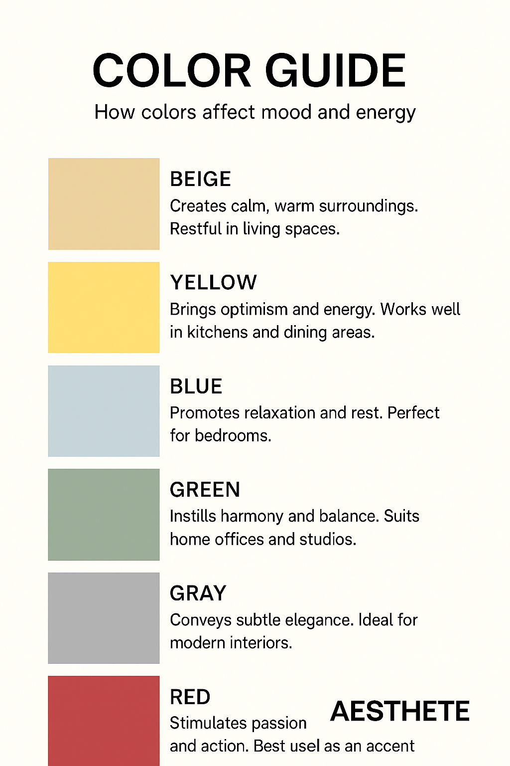
- Warm colors like red, orange, and yellow are stimulating, cozy, and energizing.
They can make large spaces feel more intimate and vibrant. - Cool colors like blue, green, and violet are calming, fresh, and spacious. They often work well in bedrooms, bathrooms, and peaceful corners.
Balance is key: using both warm and cool tones thoughtfully helps create harmony and depth.
The Psychology of Common Interior Colors
Let's explore what different colors typically evoke and where they shine best.
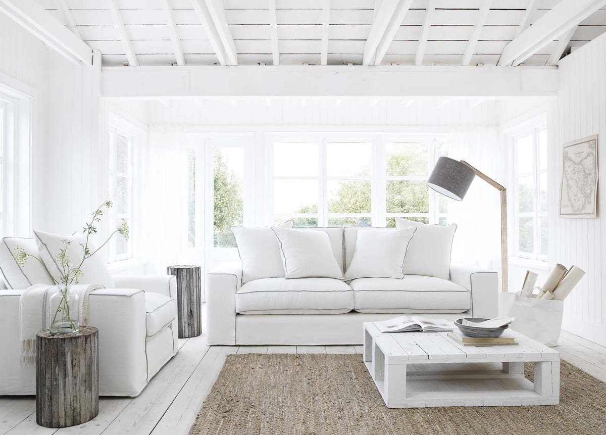
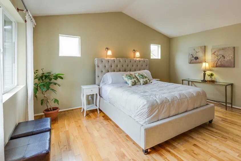
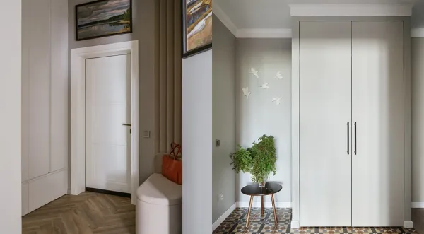
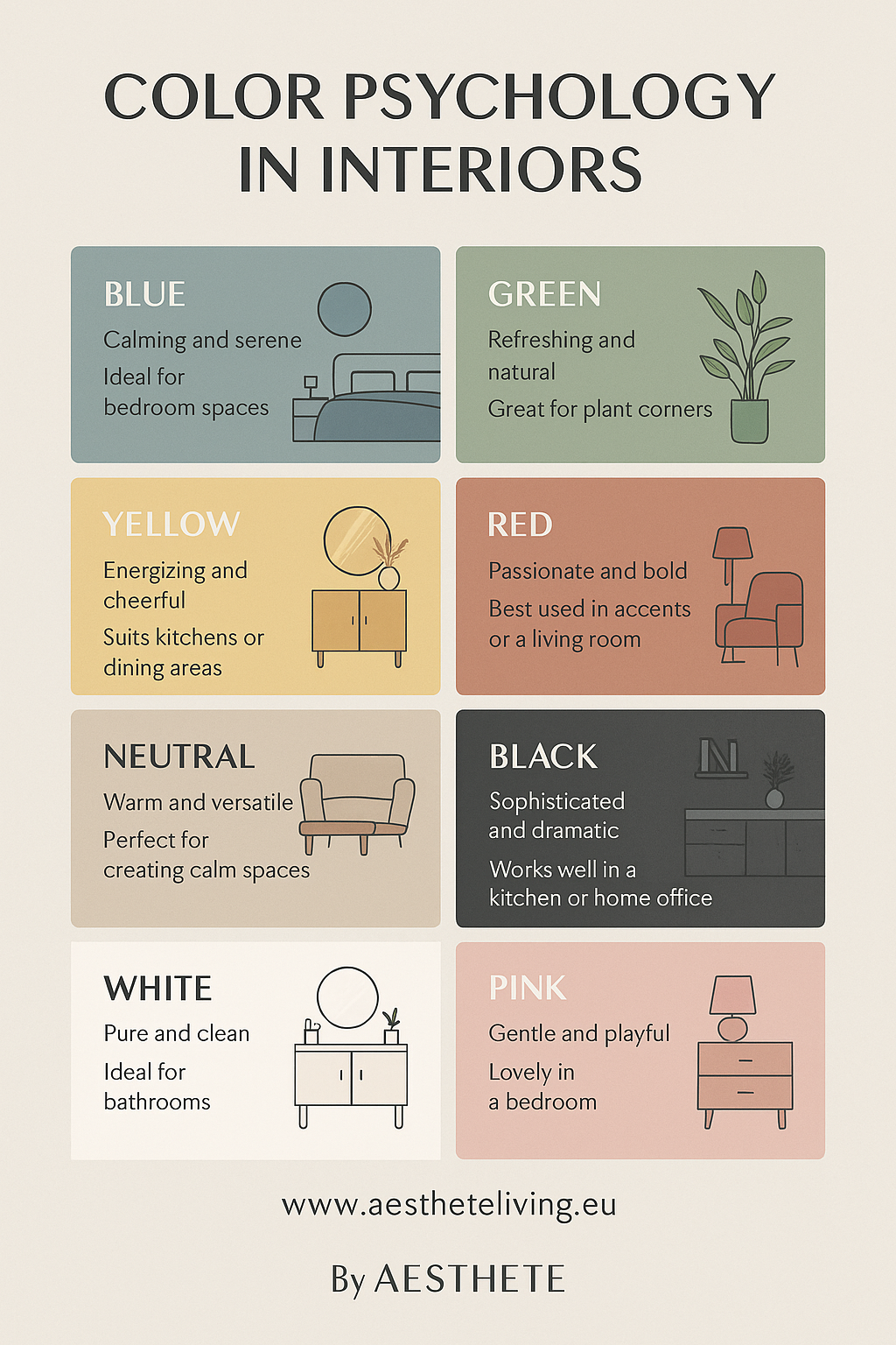
White: Clean, Calm, Open
- Emotion: Freshness, clarity, purity
- Best for: Minimalist space, small rooms that need light, kitchens, and bathrooms
- Tips: Too much white can feel sterile. Soften it with texture and natural materials.
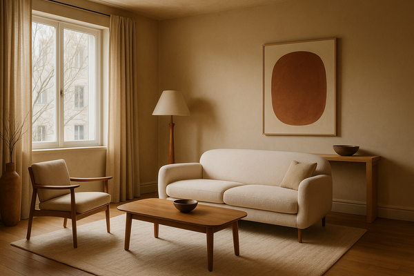
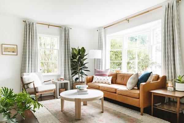
Beige & Taupe: Safe, Neutral, Warm
- Emotion: Stability, comfort, subtle elegance
- Best for: Living rooms, bedrooms, transitional styles
- Tips: Add layered lighting and texture to keep it from feeling flat
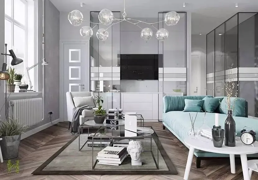
Gray: Sophisticated, Cool, Balanced
- Emotional: Control, quiet, elegance
- Best for: Modern spaces, offices, calm bedrooms
- Tips: Lighter grays feel airy; darker tones feel dramatic.
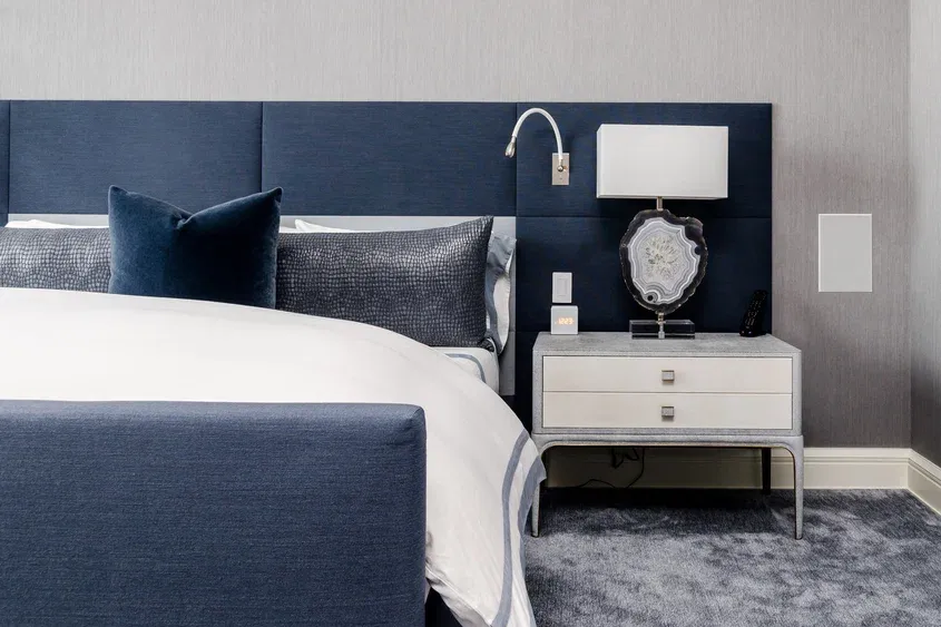
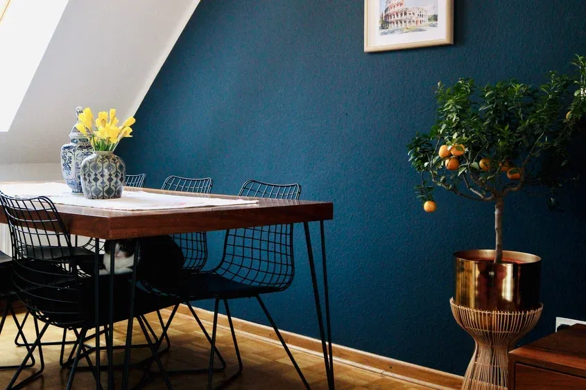
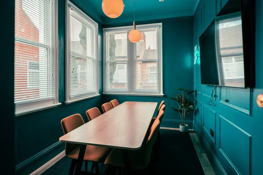
Blue: Tranquil, Clear, Focused
- Emotion: Peace, trust, calm
- Best for: Bedrooms, bathrooms, offices
- Tips: Softer blues soothe; navy and cobalt bring bold energy
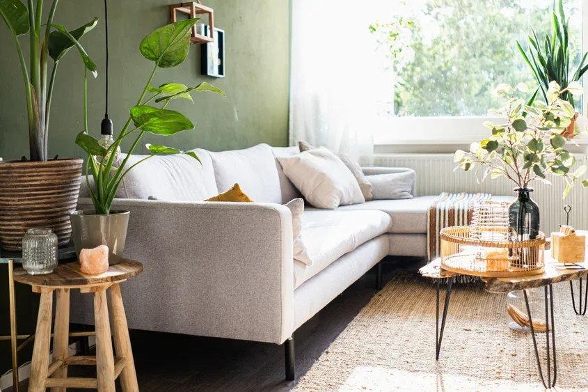
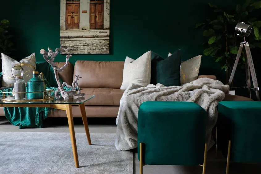
Green: Fresh, Restorative, Balanced
- Emotion: Nature, health, harmony
- Best for: Bedrooms, kitchens, biophilic design
- Tips: Pair with natural materials like wood and stone for a grounded feel.
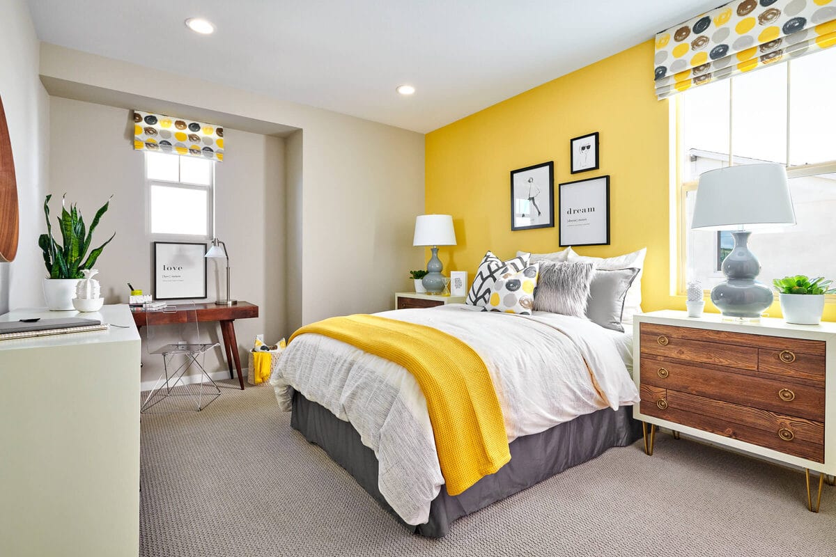
Yellow: Joyful, Energetic, Bright
- Emotion: Happiness, motivation, optimism
- Best for: Kitchens, dining areas, sunrooms
- Tips: Use in moderation, too much yellow can become overwhelming.
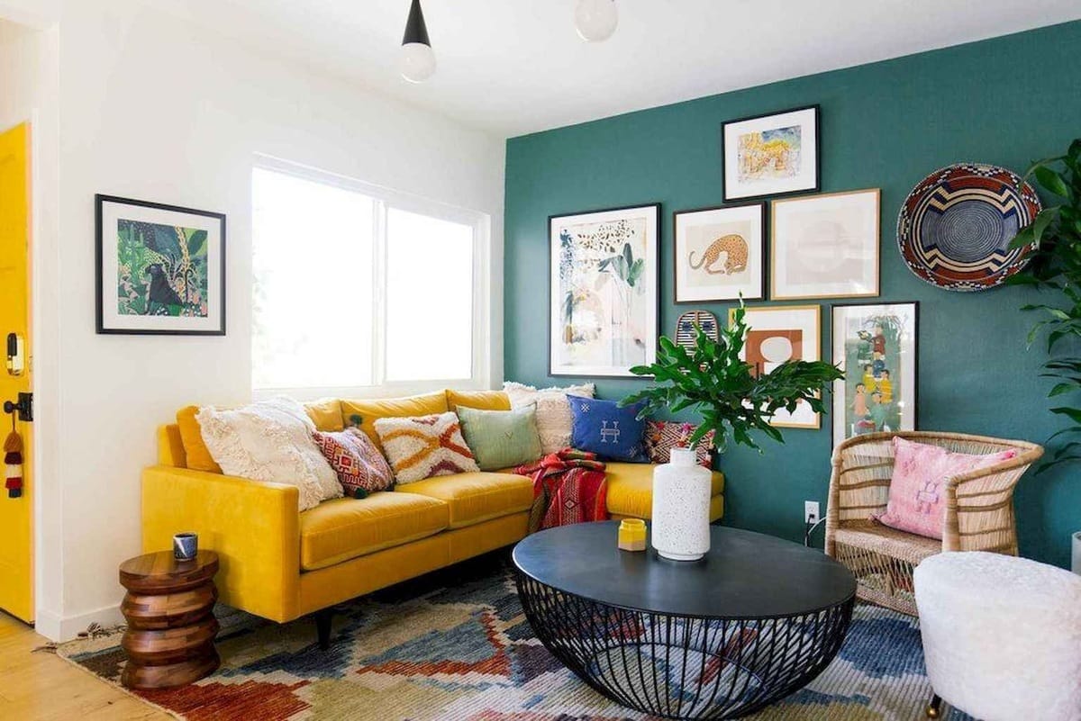
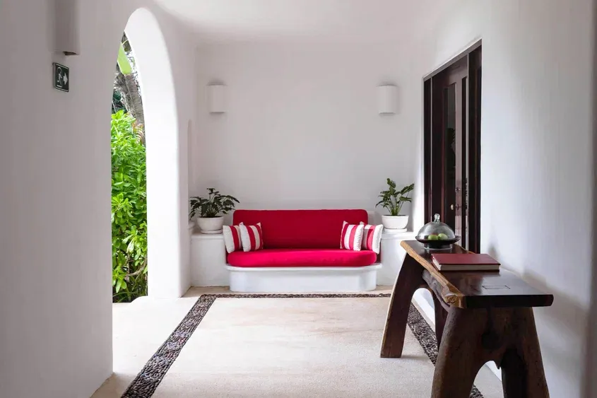
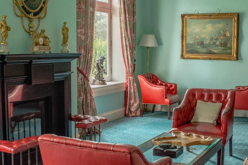
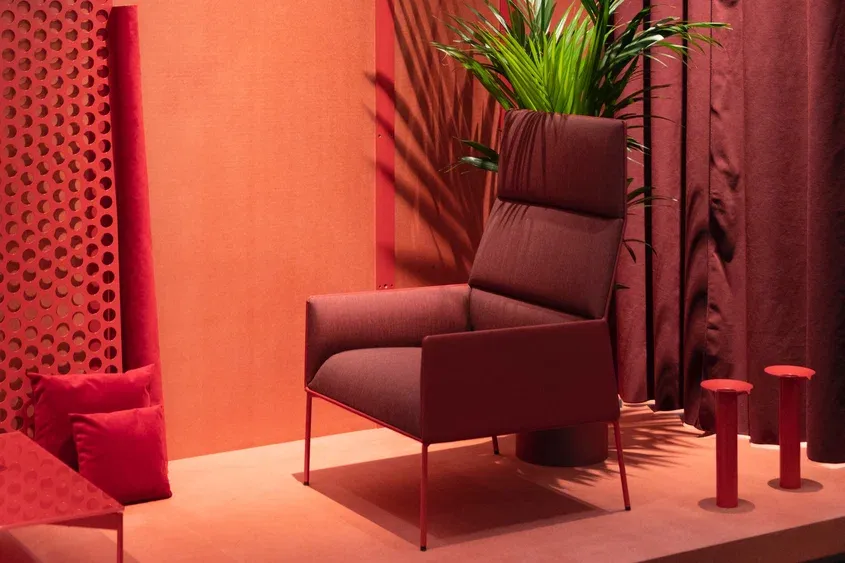
Red: Passionate, Bold, Intense
- Emotion: Energy, excitement, warmth
- Best for: Dining rooms, accent walls, creative space
- Tips: Use as a pop of color, not an all-over wall color unless the room gets lots of natural light.
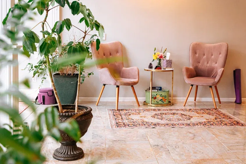
Pink: Gentle, Warm, Soft
- Emotion: Nurturing. romantic, playful
- Best for: Bedrooms, nurseries, reading corners
- Tips: Dusty or muted pinks feel more grown-up and elegant.
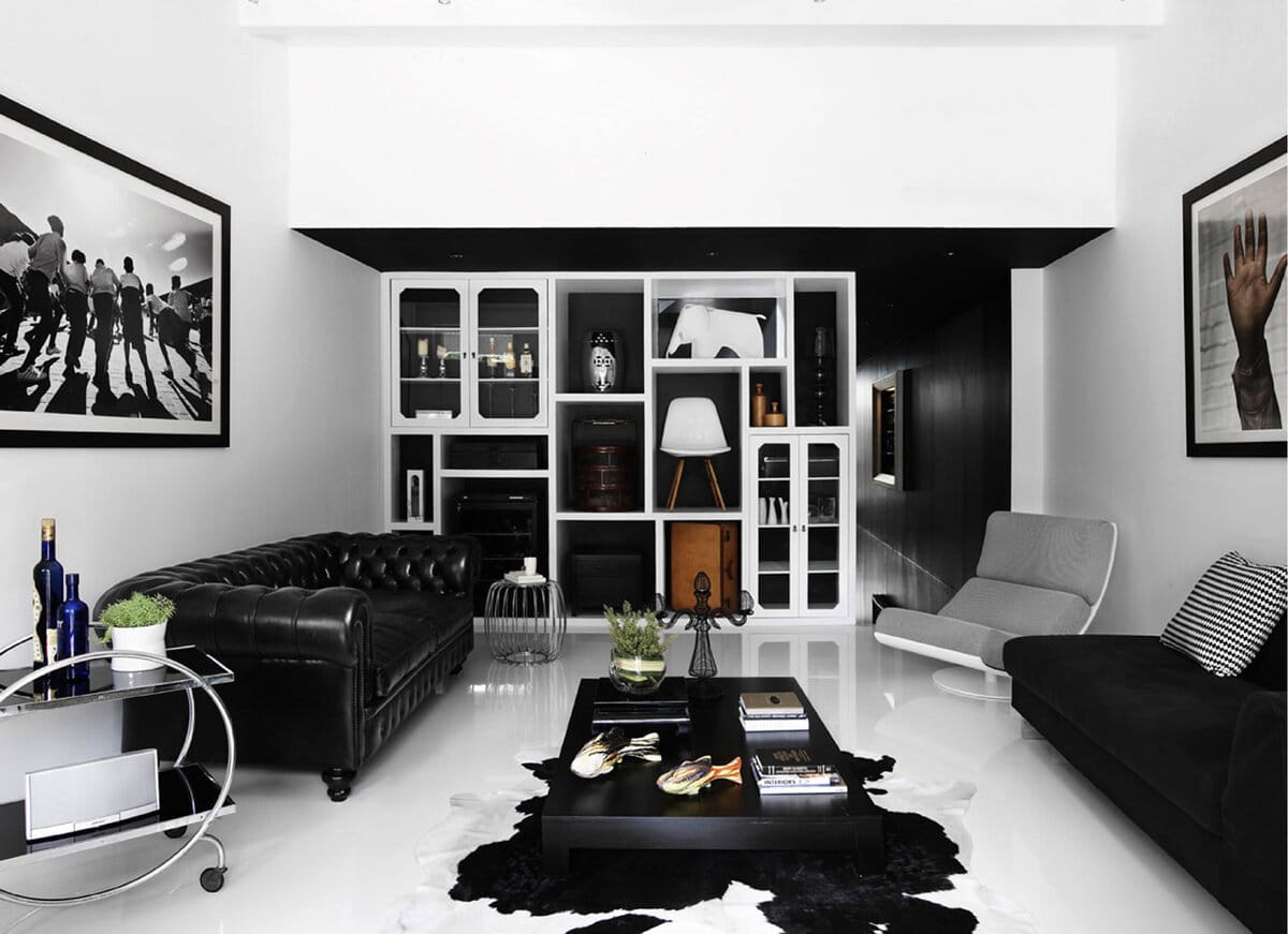
Black: Strong, Elegant, Grounding
- Emotion: Luxury, depth, drama
- Best for: Accents, fixtures, gallery walls
- Tips: Combine with lighter tones to avoid feeling heavy or dark.
Brown: Earthy, Stable, Cozy
- Emotion: Comfort, reliability, grounding
- Best for: Living rooms, libraries, rustic or boho styles
- Tips: Add green plants or warm lighting to keep it fresh.
How to Choose the Right Colors for Your Home
- Start with a function
What do you want to feel in the space? Calm, energized, focused? Let the function guide your palette. - Let light be your guide
Natural light brings out the true character of color. A north-facing room will feel cooler than a sun-filled south-facing one. - Use color to create zones
Even in open spaces, color can define areas like a cozy reading nook painted a different shade. - Balance bold with neutral
If you go bold on walls, keep furniture and accessories soft or vice versa. - Stick to a palette
Use 2-4 core colors throughout your home for cohesion. Let tone and material provide variation.
Pro Tip: Use the 60-30-10 rule
This classic design rule helps balance your color scheme:
- 60% - Dominant color (walls, large furniture)
- 30% - Secondary color (upholstery, curtains)
- 10% - Accent color (pillows, art, vases)
It keeps everything intentional, without being boring.
My Final Thoughts: Feel First, Then Paint
Color is emotional. The most stylish room won't feel right if the color doesn't match the mood you want.
So before choosing what looks good, ask yourself:
What do I want to feel when I walk into this space?
Once you answer that, your palette will follow.