Lesson 15: How to Choose Furniture Colors
Choosing the right furniture color can transform your home, but with so many options, where do you start? In this guide, we explore the most popular wood finishes like walnut, oak, and pine.


Choosing the perfect color for your furniture is no easy task. With todays endless palette of options, picking just one shade can take days of research and reflection. I will compile on how to avoid common mistakes, stay on trend, and create a timeless, beautiful space that feels like home.
Furniture color isn't just about aesthetics; it also depends on the material. Solid wood, veneered panels, natural textiles, plastic, and eco-friendly surfaces all offer a different range of tones. Some materials (like real wood) have limited natural shades, while others (like MDF or recycled composites) allow for endless customization.

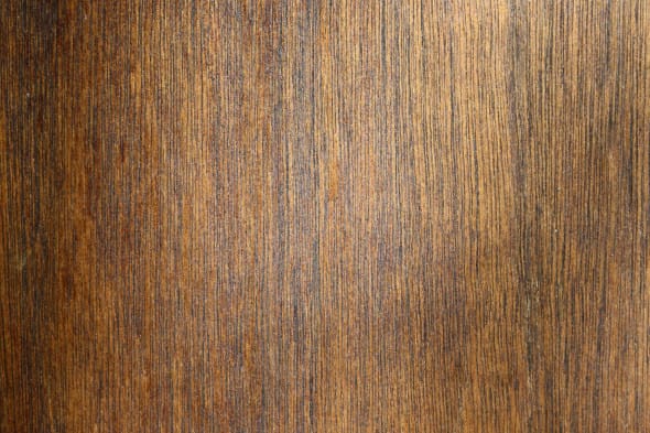
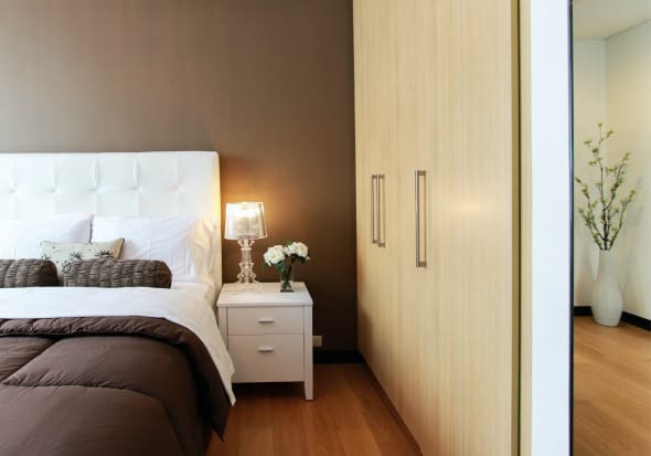
Wenge

Wenge is a deep, rich brown wood with subtle black undertones. It comes from an exotic African tree and is known for its luxurious, dramatic appearance. True wenge wood is rare and expensive, but it's often imitated in furniture finishes.
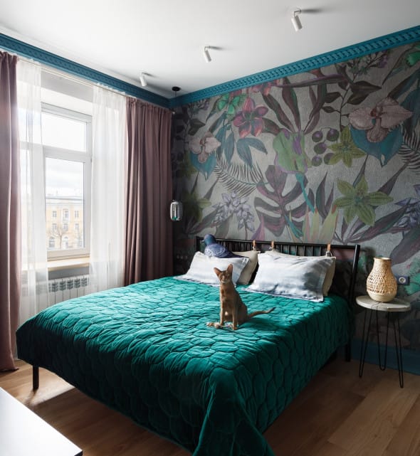
This color works beautifully for large statement pieces like wardrobes, wall units, or headboards. It adds contrast in bright spaces and pairs with beige, white, or even jewel tones like emerald or navy.
Beech
Beech is a warm, light-toned wood with soft amber or cream shades. Its subtle grain pattern and smooth texture make it a favorite for both modern and classic interiors.
There are several variations:
- Whitewashed beech - close to pure white, great for Scandinavian-style rooms;
- Smoked beech - a slightly darker tone that leans toward soft brown.
Beech works well as a neutral base, letting your walls, art, or textiles take the spotlight. It's especially popular for dining sets and bedroom furniture.
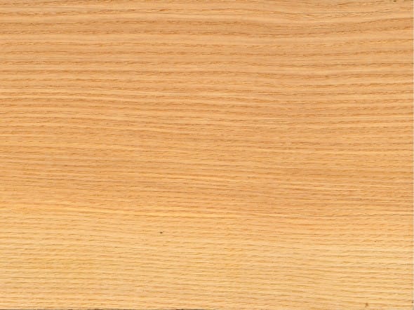
Oak
Oak is one of the most versatile woods in interior design. Known for its strong grain and solid durability, it comes in many finishes:
- Golden oak - warm, classic, and timeless;
- White oak - with pink or pearly undertones;
- Matured oak (stained or fumed) - almost black, perfect for moody interiors;
- Milk oak - a trendy shade with hints of blush or cream.
Oak fits beautifully into modern, rustic, and transitional styles. Its a great choice for cabinetry, flooring, or living room pieces where you want a natural, lived-in feel.
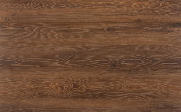
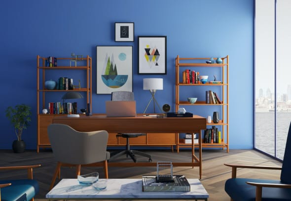
Walnut
Walnut brings an earthy, cozy richness to any room. With shades ranging from soft honey to deep espresso, walnut offers incredible depth and sophistication.
Designers often use:
- Italian walnut - a golden, caramel tone;
- American black walnut - dark and dramatic;
- Spanish walnut - somewhere in between.
Walnut is ideal for timeless, elegant spaces, think libraries, offices, or master bedrooms. Its tones pair well with whites, greens, and metallic accents like brass or gold.
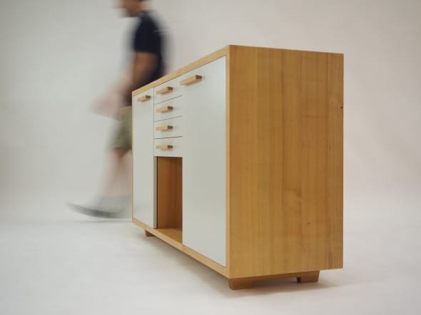
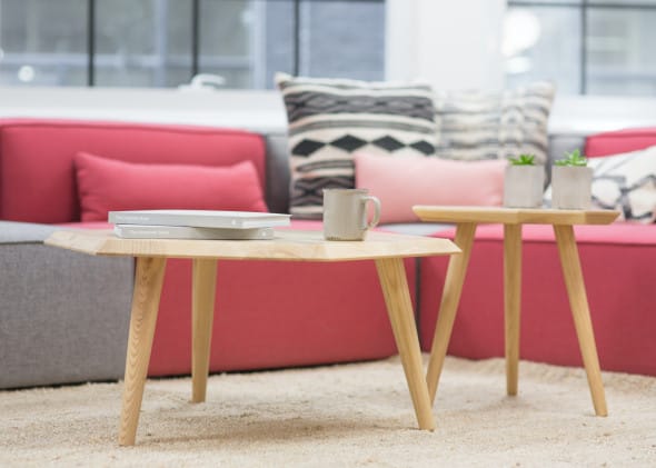
Pine

Pine is light, fresh, and airy, a perfect wood for relaxed and natural interiors. It typically comes in creamy white or very soft beige, often with visible knots and grain patters that give it charm.
A popular trend today is winter pine, a slightly greyish or whitewashed version that works beautifully in Scandinavian or eco-style homes.
Pine furniture blends easily with bold wall colors or printed textiles and suits both country and modern spaces.
Popular Color Trends in 2025
2025 is all about warmth, nature, and emotional comfort.
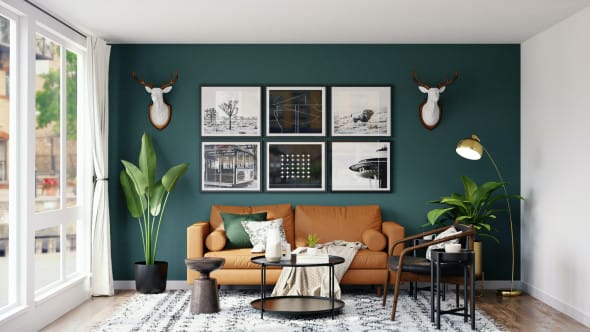
1. Terracotta & Browns
From soft caramel to chocolate and burnt orange, earthy brown tones are back in style. These warm shades replace sterile whites and bring a cozy, grounded feeling to living spaces.
2. Nature-Inspired Shades
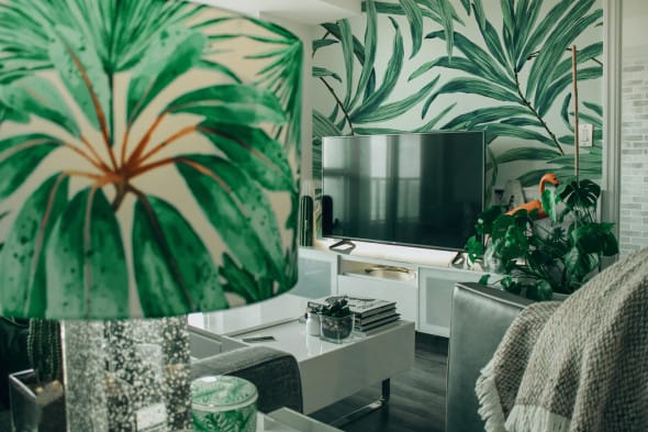
Muted, dusty greens, stormy blues, and stone greys continue to dominate design palettes. These colors work especially well with wood furniture, creating a calm, soothing atmosphere.
3. Eco-Friendly Neutrals
Recycled, natural materials are trending, and so are their signature colors: craft beige, oat, taupe, and soft clay. These tones feel modern, sustainable, and easy to pair with any aesthetic.
How to Choose the Right Color for Your Furniture
Here's what to consider before you make a decision:
1. Interior Style
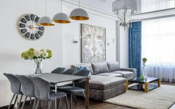
Let your existing palette guide you. If your walls are vibrant, you might want neutral furniture for balance. For minimal interiors, add a bold accent with colored upholstery or statement pieces.
For example:
- Classic style - opt for ash, maple, or walnut;
- French country or Provencal - consider birch or light oak.
2. Room Function
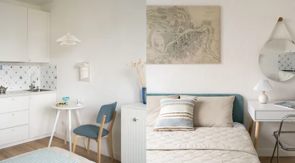
Bedrooms benefit from calm, light-colored furniture. Children's rooms can handle brighter, playful tones. Living rooms should strike a balance between warmth and personality - this is where color coordination matters most.
3. Lighting
Always test your chosen color under natural and artificial light. A sofa may look taupe in a showroom but greenish under your home's lighting. Use samples or swatches to test how the color behaves in your space.
4. Ease of maintenance
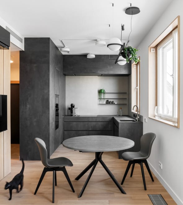
Lighter furniture hides dust better, but shows stains. Dark furniture hides spills, but can make every speck visible. For practicality, designers recommend soft woods like milk oak, ash, or beech, especially in high-use areas.
How to Match Furniture, Walls & Flooring
The most successful interiors create harmony, not just through color, but through contrast and texture.
Here are a few tips:
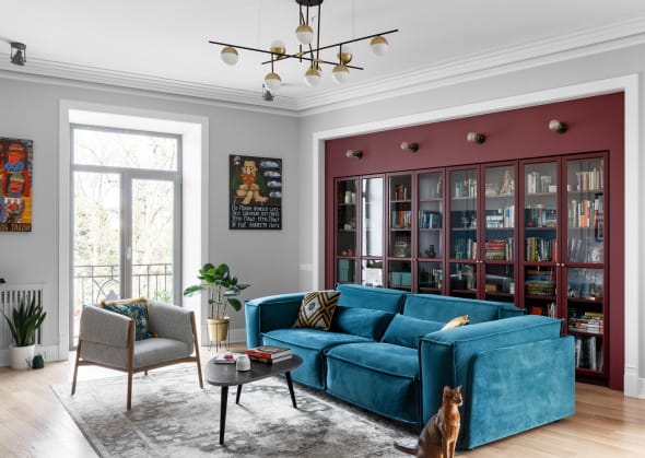
- Use neutral walls and flooring as a canvas, then layer in deeper furniture tones.
- Choose complementary contrasts, like a white wall with a deep walnut table;
- Break monotony with colorful statement pieces - a bold armchair, a painted cabinet, or colored textiles.
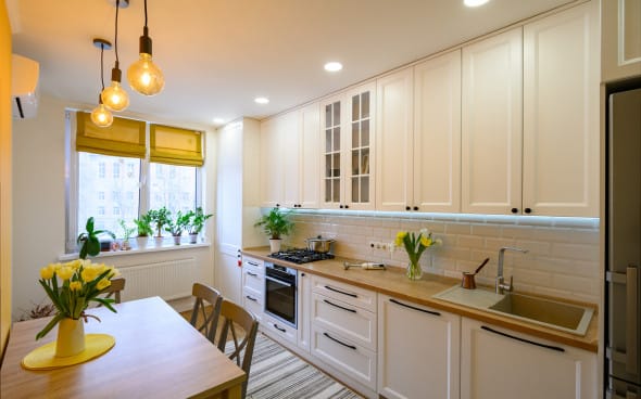
Well-chosen furniture can visually merge with the architecture. For example, kitchen cabinetry that blends into wall panels or sofa sets that mirror the tone of the floor.
Common Mistakes When Choosing Furniture Colors
To avoid buyer's remorse, here are mistakes to steer clear of:
- Avoid matching whites - white appliances, walls, and furniture rarely match in tone and may clash.
- Buying at different times - wood finishes (like wenge or oak) can vary between manufacturers, even with the same name.
- Trusting showroom light - test samples at home under your lighting before committing.
- Ignoring daylight vs. evening light - colors change throughout the day. Make sure your choice looks good in all conditions.
- Forgetting practicality, your furniture should be easy to live with and adaptable if you ever redecorate.
Final Thoughts
Color is one of the most powerful tools in interior design; it influences mood, space perception, and how we feel in a room. Choosing the right shade for your furniture is not just about following trends, but about creating a home that reflects your style and supports your lifestyle.
Enjoyed this lesson? There's more waiting.
Support Aesthete to unlock the full archive of architecture and interior style lessons - including tomorrow's post on Avant-garde interiors, plus 70+ exclusive deep dives, style guides, and subscriber bonuses.
For just 3.99/month, you'll get:
- Access to all premium lessons
- A downloadable Style Index PDF (coming soon!)
- Exclusive moodboards and design tips
Become a Supporter Now - help keep thoughtful design content independent.